Modern, Rustic & Minimalist Kitchen Ideas That Work
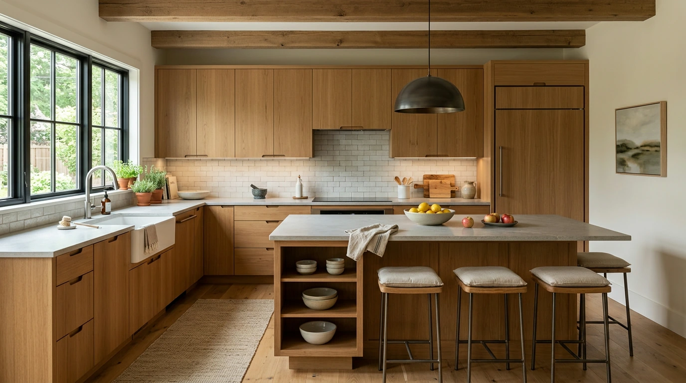
Dream Kitchens Made Practical: Modern, Rustic & Minimalist Design Ideas with Smart Storage and Layout Planning
A beautiful kitchen succeeds when style choices and day-to-day function support each other. The goal isn’t just a “pretty” space—it’s a room that stays organized, moves smoothly from prep to cleanup, and feels cohesive year after year. Use the modern, rustic, and minimalist ideas below to plan finishes, storage, lighting, and layouts that work for real life, whether you’re doing a light refresh or a full renovation.
Start with a Kitchen “Priority Stack”
Before choosing tile or paint, decide what the kitchen must do for you. Start with the non-negotiables: seating needs, pantry capacity, island versus table, and how you cook (batch cooking, entertaining, baking). Next, list the friction points you want gone—cluttered counters, dark corners, awkward appliance doors, or trash access that forces extra steps.
Then separate what must stay (plumbing locations, windows, structural walls) from what can change (cabinetry, lighting, surfaces). To keep decisions consistent, set a three-word visual direction—something like “warm, clean, textured”—and use it as a filter for every finish. Finally, be honest about maintenance: high-touch natural materials can be worth it, but wipe-clean surfaces and integrated pulls often make daily life easier.
Layout Choices That Make Everyday Tasks Easier
Great layouts reduce back-and-forth. Map the three paths used most often: fridge-to-sink, sink-to-cooktop, and cooktop-to-serve area. Keep them short, direct, and unobstructed by traffic or open appliance doors.
Plan “landing zones” too: aim for about 15–18 inches of counter next to the cooktop/oven and near the fridge so you can unload safely and set ingredients down without juggling. For islands, prioritize clear aisles for traffic and appliance swings. A prep sink is only worth it if it truly saves steps (and doesn’t steal storage you’ll miss later).
Common Kitchen Layouts at a Glance
| Layout | Best for | Watch-outs | Smart upgrade |
|---|---|---|---|
| Galley | Small to mid-size spaces with focused workflow | Can feel narrow; limited seating | Full-height storage on one end + under-cabinet lighting |
| L-shaped | Open-plan living and flexible work zones | Corners can waste space | Corner pull-outs + a mobile island or peninsula |
| U-shaped | Maximum counter space and efficient prep | Can restrict traffic if aisles are tight | One leg as a peninsula for seating + shallow uppers |
| Single-wall | Studios and compact homes | Limited work triangle | Tall pantry + pull-out base organizers + wall-mounted rail system |
Modern Kitchens: Clean Lines, High Function
Modern kitchens feel calm because the details are disciplined. Look for flat-panel doors, integrated pulls, and consistent reveals that create a streamlined rhythm. To avoid a cold result, balance sleek surfaces with materials that have natural character—rift-sawn oak, honed stone, and brushed metal accents work especially well.
Color feels most intentional when you choose two neutrals (one warm, one cool) plus a single accent tone used sparingly. For lighting, layer recessed ambient lights with under-cabinet task lighting, then add one statement pendant over the island or table. Keep metals simple: pick one dominant finish and only mix if the shapes and undertones match.
Rustic Kitchens: Warmth, Texture, and Timeless Comfort
Rustic kitchens shine when they feel collected, not cluttered. Natural wood grain, handmade tile, and tactile textiles add warmth quickly, but they work best when balanced with modern efficiency—durable counters, easy-clean backsplashes, and storage that hides the mess.
To avoid visual heaviness, choose one hero texture (beams, stone, or reclaimed wood) and keep other patterns quieter. Layered neutrals—cream, warm gray, clay, olive, and soft black—create depth without busyness. If you love patina, repeat it 2–3 times (aged brass on hardware, a vintage-style pendant, and a matching faucet) so it reads as cohesive rather than random.
Minimalist Kitchens: Calm Surfaces, Hidden Storage
Minimalist design isn’t about having less functionality—it’s about having fewer visual distractions. Prioritize closed storage, aligned door heights, and a limited palette of two to three materials. Keep counters clear by giving small appliances “parking spots” in an appliance garage, a pull-out shelf, or a dedicated pantry cabinet.
Smart Storage That Actually Solves Problems
Renovation Planning: Durable Choices and Fewer Regrets
Ventilation is comfort you notice daily—size the hood to your cooktop and plan ducting routes up front. ENERGY STAR’s guidance on ventilating fans can help you compare performance and efficiency (ENERGY STAR ventilating fans). For layout clearances and best practices, consult the industry standards from the National Kitchen & Bath Association (NKBA Kitchen Planning Guidelines). If you want visual references for finishes and layouts, browsing real projects can clarify preferences quickly (Houzz kitchen photos).
A Simple “Cohesion Checklist” for Any Style
Recommended Picks
- Inspiring Kitchen Interior Design Ideas | Modern, Rustic & Minimalist Kitchen Design eBook | Smart Storage, Layouts & Renovation Guide for Dream Kitchens
- Cactus Cat Tree Tower with Scratching Post & Condo Nest
- Alviero Martini Prima Classe Women’s Beige Bag with Zip
FAQ
What’s the easiest way to choose between modern, rustic, and minimalist kitchen styles?
Pick a three-word direction (like “bright, warm, simple”), then choose one dominant material (wood, stone, or metal) plus one signature detail. Confirm it fits your maintenance preferences and feels compatible with your home’s architecture.
Which storage upgrades make the biggest difference without increasing the kitchen size?
Focus on deep drawers, pantry pull-outs, a trash/recycling pull-out near the prep zone, vertical tray dividers, and under-sink organizers designed around plumbing clearance. These upgrades improve visibility and reduce counter clutter fast.
How can a kitchen look clean and minimal while still feeling warm?
Limit the number of materials, then add warmth through wood tones, matte finishes, layered lighting, and one tactile element like handmade tile or linen window treatments. Keeping surfaces clear makes the warm details stand out.









Leave a comment