Cozy Table Color Checklist: Warm Palettes in Minutes
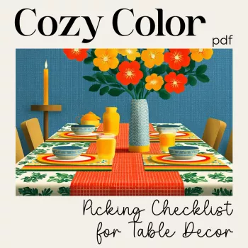
Cozy Color Picking Checklist: A Warm, Welcoming Table Palette You Can Build in Minutes
A cozy table doesn’t start with more décor—it starts with a color plan that makes everything feel like it belongs together. Our printable checklist is designed to help you pick warm neutrals, anchor shades, and small pops of color that read as inviting (not busy), whether you’re setting the table for everyday dinners, a slow Sunday brunch, or a holiday gathering. Use it as a quick decision tool before buying linens, candles, or serving pieces—so the finished table feels calm, layered, and intentionally warm. For more guidance, see Design Essentials.
What “cozy” color really means at the table
When a table feels cozy, it usually has one job: make everyone want to linger. Color does that when it’s warm, softly layered, and repeated with intention. For further reading, see What is Color Theory? — updated 2026.
- Start with warmth: lean into undertones that feel sunlit—cream, oatmeal, camel, terracotta, warm taupe, tobacco, honey, muted blush, and olive that skews brown rather than blue.
- Aim for softness over contrast: cozy tables typically live in medium-to-low contrast, with one deeper shade for grounding (espresso, deep olive, rust) instead of harsh black-and-white.
- Repeat, don’t match: repeating a warm undertone across linens, dinnerware, and candles looks collected and effortless even when pieces aren’t from a “set.”
- Balance matte and glow: warm palettes feel cozier when most surfaces are matte or textured (linen, ceramic, wood) with small touches of glow (glass, metallic cutlery, candlelight).
Cozy palette building blocks (quick reference)
| Layer | What it does | Warm, welcoming examples | Easy places to use it |
|---|---|---|---|
| Base neutral | Creates calm, keeps the table light | Ivory, cream, warm white, oatmeal | Tablecloth/runner, plates, napkins |
| Secondary neutral | Adds depth without clutter | Warm taupe, sand, camel, stone | Chargers, placemats, serving bowls |
| Anchor shade | Grounds the look, adds “cozy weight” | Espresso, deep olive, rust, cocoa | Candlesticks, a centerpiece vessel, menu cards |
| Accent color | Brings life in small, intentional hits | Terracotta, muted blush, honey, copper | Taper candles, florals, fruit, small décor |
| Metal tone (optional) | Adds warmth and a finished feel | Brass, antique gold, copper | Flatware, candle holders, small trays |
How to use the Cozy Color Picking Checklist (a simple flow that prevents overbuying)
Our team built the checklist to act like a “pause button” before you add one more thing to your cart. Instead of collecting random pieces, you’ll decide what layer you’re actually missing.
- Choose the base neutral first: pick one light warm neutral that covers the biggest surface area (linen, runner, or primary plates).
- Add one supportive neutral: select a second neutral that’s slightly deeper or warmer to keep the table from feeling flat.
- Pick an anchor shade: decide on one deeper tone that shows up at least twice (example: espresso candles + a dark wood board).
- Limit accents to one “flavor”: choose one accent family (terracotta OR blush OR honey) and repeat it in small doses instead of mixing bright colors.
- Check undertones in one glance: confirm your pieces share warm undertones (yellow/red) rather than clashing with cool gray or icy white.
- Lock your 60/30/10 balance: keep the table mostly neutrals (60), add depth (30), then finish with a small accent (10).
If you want a fast refresher on warm vs. cool and why some “whites” look icy next to candlelight, see Color temperature (warm and cool colors) and the fundamentals of hue/value/saturation at Encyclopaedia Britannica’s color overview.
Three cozy table palettes that work year-round
- Cream + Camel + Espresso (classic cozy): soft, coffeehouse warmth; great for everyday dinners and clean-lined spaces that still want depth.
- Oatmeal + Terracotta + Olive (earthy welcoming): grounded and natural; pairs beautifully with stoneware, wood boards, and simple greens.
- Warm White + Taupe + Honey + Brass (soft glow): bright but warm; ideal when you want an airy table that still feels inviting.
One easy trick: choose a repeating “thread” (like warm beige) and weave it through napkins, candles, and one serving piece. That repetition is what makes the palette feel intentional.
Fix common color problems in seconds
- The table looks “gray” or cold: swap cool white for cream, replace a silver tone with brass, or add one warm wood element to shift the temperature.
- Too many colors competing: reduce accents to one family and convert the rest into neutrals (tan, warm taupe, ivory).
- Everything blends together: introduce one anchor shade (espresso, deep olive, rust) and repeat it twice—once tall (candles) and once low (a bowl or napkin ring).
- The centerpiece feels loud: keep florals/greens within the palette and let texture (linen, ceramic, wood grain) do the heavy lifting.
- The setting feels unfinished: add a small metal tone (brass/copper) or a second neutral layer (placemat or charger) for structure.
Print, style, and reuse: making the checklist part of your hosting routine
Shop our picks (in stock)
- Cozy Color Picking Checklist for Warm, Welcoming Table Decor (Printable)
- Alviero Martini Prima Classe Women’s Beige Bag with Zip
FAQ
How many colors should a cozy table palette include?
Plan for 3–5 total: one base neutral, one secondary neutral, one anchor shade, and one accent (plus an optional metal tone). The “cozy” look comes from repeating those colors instead of adding more.
What’s the easiest way to keep warm neutrals from looking dull?
Layer in texture and depth: add one anchor shade, mix matte surfaces with a little glow, and use two neutrals with different depths (like cream + camel). Keep accents small but repeated so they feel intentional.
Can this checklist work with existing dishes and linens?
Yes—start with what you already own as your base (like warm-white plates), then choose a supportive neutral and one anchor that complement the undertones. That approach lets you update the mood with a runner, candles, or napkins instead of replacing everything.











Leave a comment